Tag Archives: #LibraryStatOfTheWeek

Library Stat of the Week #50 (Part 2): Where there are stronger and better used public and community libraries, more people read, more often

In the final post both of this mini-series on libraries and cultural data, and of our regular Library Stat of the Week posts, we return to a core function of libraries – to promote reading and access to books.

In the past three weeks, we have looked at data around how much households spend on books, as well as on wider data around participation in artistic and cultural activities. In each case, it appears that having more libraries, and using them better, is linked to greater spending and engagement.

This week, we look at data on how people spend their time, and in particular on how many people read regularly, and then how long they spend doing it.

For many, simply encouraging more reading is an end in itself, although of course this can also have positive impacts on issues such as wellbeing (a key issue during the pandemic!), literacy (skills can deteriorate if not used) and of course on the health of the wider cultural sector.

Once again, we are drawing on data from Eurostat, and in particular the Time Spent on Cultural Activities dataset (gathered between 2008 and 2015). Given its focus, it only covers countries in Europe, but offers insights that can apply elsewhere. As ever, data on libraries comes from the IFLA Library Map of the World, crossed with World Bank population data.

To set the scene, we can look already at what we know about people’s habits around reading, in particular throughout their lives.

Graph 7a: Average Time Spent Reading per Day Over Life

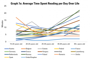
Graph 7a does this by looking at the average time spent reading per day per person, broken down by different age groups. It shows that, in general, there is a U-shaped curve, with people reading more when they are younger and when they are older, with 25-44 year olds reading least on average.

There are exceptions within this. For example, Romanian 15-20 year olds on average read more than any others in Europe. However, older Romanians (aged 65+) are the second least regular readers. Meanwhile, young Austrians and Dutch are low readers, but their parents and grandparents on average spend a much more average amount of time reading.

Graph 7b: Average Time Spent Reading by Readers Per Day

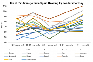
Graph 7b looks only at those people declaring that they do read regularly, and explores how long they spend doing this. While there is, again, a dip in average time spent reading among the 25-44 age group, this is less dramatic. Hungarian readers show up across all age groups as one of the nationalities that reads most when they do.

Graph 7c: Share of the Population Reading Books

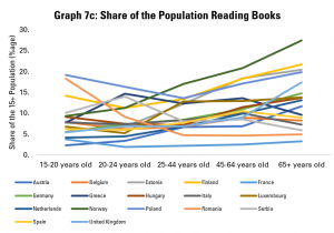
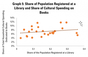
The other driver of overall figures on how much people read on average is data about the share of the population reading at all. Graph 7c explores this, noting that the share of the population reading in general tends to be relatively stable, or drop between 15-20 and 25-44 year olds, and then rise relatively sharply among older groups. For example, while only an average share of younger Norwegians read, a larger share of older Norwegians than in any other country covered read. Similarly, from coming almost bottom of the class among younger groups, the older Dutch and Austrians come around average when it comes to the share of older people reading.

Graph 7d: Reading Intensity and Extensiveness

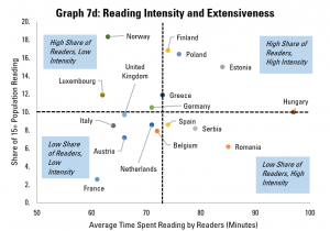
We can get an overview of the extensiveness (i.e. share of the overall population reading) and intensity (time spend reading by those who do) in Graph 7d, which looks at populations as a whole.

This shows us that Finland, Poland and Estonia do not just have an above average share of readers in the population, but those who do read tend to do so for longer. In contrast, Italy, France, Austria, the Netherlands, Belgium and the United Kingdom have both a below-average share of readers in the population, and those who do read do so for shorter times than average.

Finally, there is a contrast between Norway, Luxembourg and Germany (more readers, but reading for shorter times), and Spain, Serbia and Romania (fewer readers, but those who do read for longer). A separate analysis of the situation for different age groups could also be interesting here, in order to understand whether the main challenge in increasing reading is to allow more time for this, or to get more people reading in the first place.


Having looked at reading habits, it is now time to look at the relationship between libraries and reading.

Graph 8a: Public/Community Libraries per 100 000 People and Average Time Spent Reading

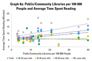
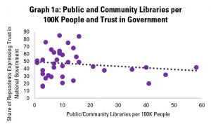
Graph 8a looks at the availability of public and community libraries, as measured by the number of libraries per 100 000 people, compared to the average time spent reading by different age groups. It finds that there is a positive correlation for the population as a whole, mainly driven by older readers (those aged 45-64 and 65+). The link is less obvious for younger readers (aged 20-24 and 25-44).

Graph 8b: Public/Community Libraries per 100 000 People and Time Spent Reading by Readers

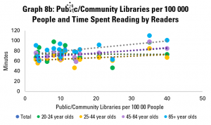
Graph 8b looks at the amount of time spent reading by those who do read. This again shows a gentle, but positive correlation – in other words, in countries with more public and community libraries, those people who do read tend to spend more time doing so. Looking across age groups, the correlation is positive for all, although only slightly in the case of 20-24 year olds.

Graph 8c: Public/Community Libraries per 100 000 People and Share of Population Reading

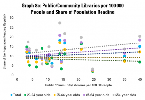
Graph 8c looks at numbers of public and community libraries, and the share of the population in different age groups reading. Again, it finds weak but positive correlation between numbers of libraries and tendency to read, with stronger links for older groups. The picture is similar if we look only at countries with up to 20 public or community libraries per 100 000 people.

Overall, the story from this is that pure numbers of libraries are positively linked with how many people read, and how much they do, but not particularly strongly.

Graph 9: Public/Community Library Workers per  100 000 People and Share of Population Reading

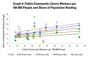
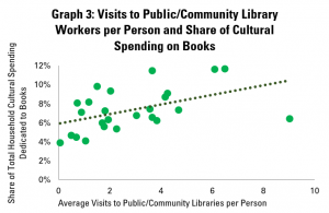
Graph 9 goes a little further, looking rather at numbers of public and community library workers. This is, arguably, a stronger indicator of how much is being invested in the library field, as well as its ability to reach out to readers, welcome them, and support literacy.

This shows a more positive link between the strength of the library field and share of adults reading, with an increase of 10 library workers per 100 000 people tending to be linked to a rise of 1% in the share of the population reading (or 1000 people). This arguably makes sense – library staff have a key role in helping readers find books that interest them, and simply in making libraries into welcoming places.

Once again, the connection is stronger in older groups. Interestingly, it does not appear that those who do read spend more time doing so in countries with more public and community library workers.

Graph 10a: Library Visits per Person and Average Time Spent Reading

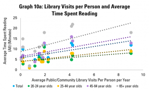
Yet as in previous posts, the strength of the library field is only part of the picture – so too is how well it is used. Graph 10a does this, using data on average library visits per person per year. It shows a positive correlation between library visits and the length of time adults in general spend on reading per year, again with more positive links among older groups.

Graph 10b: Library Visits per Person and Time Spent Reading by Readers

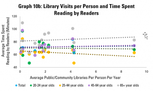
Graph 10b looks at how long those adults who read do so on average. Here, the picture is similar to that in Graph 8b, with a weakly positive correlation. Again, it appears that there is little link between libraries and how long people spend reading.

Graph 10c: Library Visits per Person and Share of Population Reading

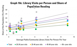
Graph 10c however looks at the share of the adult population that reads, and once again displays a strong and positive correlation. Across the population as a whole, an increase of one library visit per person per year tends to be associated with a 1.28 percentage point rise in the share of the population reading.

Graph 11: Library Loans per Person and Share of the Population Reading

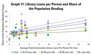
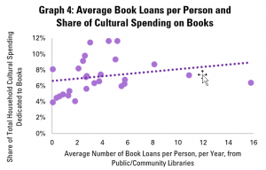
Graph 11 repeats this last analysis, but with the average number of loans from public and community libraries per person per year. Again, there is a relatively strong positive correlation, with an extra library loan per person per year associated with a 0.6 point rise in the share of adults reading. As in Graph 10c, the connection holds for all age groups, although is stronger for older ones.


What can we conclude from this? First of all, that there are significant differences in reading habits across the European countries surveyed by Eurostat. High performance – as measured by a high average length of time spent reading per person – can be influenced by the number of people reading, and how long they read for. This performance matters, given the role of reading in maintaining and strengthening skills, in promoting wellbeing, and in providing demand for writing.

Looking at the connections with libraries, it seems that there are much stronger links between libraries and the share of the population reading than between libraries and how long people spend reading.

While correlation is not causality, the data shared here would support the argument that libraries can play a role in getting more people reading, and so in helping more people benefit in terms of skills and wellbeing. In particular, numbers of library staff appear to matter more than numbers of libraries, and levels of use of libraries have a stronger link still.

This would imply that a key focus of governments looking to boost reading will likely be to ensure that libraries are well-staffed and welcoming for all.

Throughout, the relationship between public and community libraries and numbers of people reading seems weakest in general for younger groups. To some extent, this may be because many younger people have access to university libraries (in the case of 20-24 year olds in particular), or just because of less inclination to read in general among 25-44 year olds. It can also be underlined that the importance of reading for skills is more important among older groups in any case.

Nonetheless, this does raise interesting questions about whether more can be done to increase reading among 25-44 year olds, and whether libraries can strengthen their role in this.


Find out more on the Library Map of the World, where you can download key library data in order to carry out your own analysis! See our other Library Stats of the Week! We are happy to share the data that supported this analysis on request.

Library Stat of the Week #50 (Part 1): Where there are stronger, and better used public and community libraries, there tends to be greater participation in artistic and creative activities

In part one of the last of our mini-series on libraries and cultural data – and indeed the last of our regular Library Stat of the Week posts for now – we’re looking at data about libraries and the wider cultural field.

This follows two posts exploring the relationship between libraries and the book sector, measured in terms of the share of household spending on culture going on books across countries for which culture is available.

In this post, we make use of Eurostat data about frequency of participation in artistic activities (in general), and regularity of attendance at cultural events (cinema, live performances, and cultural or heritage institutions such as museums).

Once again, we also draw on data from IFLA’s Library Map of the World, combined with World Bank population data.

Given that Eurostat data only covers Europe, and that Library Map of the World data is not complete for every country, we have limited analysis to those countries for which data is available.

The goal is to explore what relationships exist between the existence and use of libraries and broader cultural participation. The thesis is that libraries can act as a gateway to culture, providing opportunities that are both local, and free, for people to discover creativity, both in others and in themselves.

The first part of this post looks at data around participation in artistic activities, compared to different metrics of availability of libraries (measured by the number of public and community libraries per 100 000 people), and their use (measured by numbers of visits and loans per capita).

Participation in such artistic activities can be used as a proxy for levels of creativity, as well as a broader indicator of the strength of culture.

Graph 1a: Public/Community Libraries per 100 000 People and Frequency of Participation in Artistic Activities

Graph 1a therefore compares the shares of the population reporting that they participate in artistic activities at least once a week, at least once a month, and not at all in the last year, with the number of public and community libraries per 100 000 people.

In this (as in all the graphs in this post), each dot represents one country. The higher up a dot is, the higher the share of people reporting that they practice an artistic activity at a given frequency. The further to the right it is, the more public or community libraries there are per 100 000 people in the country.

This finds little relationship between the presence of public and community libraries and levels of participation in artistic activities.

However, as in previous posts, it is worth looking at just those countries with up to 20 public or community libraries per 100 000 people (above the European and global averages) – this allows us to exclude more extreme cases.

Graph 1b: Public/Community Libraries per 100 000 People and Frequency of Participation in Artistic Activities (up to 20 Libraries per 100K)

Graph 1b does this, showing a much stronger link between the presence of libraries and participation in artistic activities. More public and community libraries tends to be associated with greater shares engaging regularly in artistic activities (and smaller shares not engaging at all).

For example, every extra public or community library per 100 000 people tends to be associated with a fall of almost 2 percentage points in the share of the population not engaging in artistic activities at all.

Graph 2: Public/Community Library Visits per Person and Frequency of Participation in Artistic Activities

Graph 2 continues the analysis, but looking rather at a key indicator of intensity of use of libraries – the average number of visits per person per year. This finds a similar trend as in Graph 1b, with more regular visits to libraries associated with higher engagement in artistic activities.

Here, every one additional visit to a public or community library per person per year is associated with an almost three point rise in the share of the population engaging in artistic activities at least once a month.

Graph 3: Total Loans per Person and Frequency of Participation in Artistic Activities

Graph 3 does the same but with the average number of loans per person per year, and again shows that more regular borrowing of books tends to be associated with more regular participation in artistic activities. Each additional loan per person per year tends to be linked with a fall of over two points in the share of the population not engaged in any artistic activity in the past year.

Overall, these graphs underline the connection between the presence and use of libraries, and wider involvement in artistic activities. Clearly, we cannot say for sure say that there is causality in one direction or the other. Indeed, both library use and other artistic activity could be the result of a single cause, such as a strong focus on culture in education or a wider appreciation of being cultured.

Nonetheless, it does support the argument that societies which are more involved in artistic activities – and so which arguably encourage creativity – are characterised by a greater number of public libraries (at least up to around 20 public libraries per 100 000 people), and more intense use of these.


The second part of this post looks at data around frequency of participation in specific cultural activities – namely visits to the cinema, going to live performances (theatre, concerts), and visits to cultural or heritage institutions (including monuments and museums).

This data, as far as it appears, does not include data on library visits. However, it provides an insight into the strength of the wider cultural sector. In particular, larger numbers of people going regularly to the cinema or a live performance, or visiting a cultural or heritage institution, bring advantages in terms of revenues for each of the sectors concerned.

The following analyses look at how the share of the population carrying out these different activities regularly (at least four times a year) compares with numbers of visits to libraries per person per year, as an indicator of how well used libraries are.

Graph 4a: Public/Community Library Visits and Share of 16+ Population Participating in Cultural Activities 4 or More Times Per Year

Graph 4a therefore looks at the share of the population aged 16 or more going to each of the three types of cultural event four or more times per year. It indicates a positive correlation – in countries where there are higher average numbers of library visits per year, there are also more people going regularly to the cinema, to live events, or to cultural or heritage institutions.

The most positive correlation here is between visits to libraries and visits to cultural or heritage institutions, with live performances and cinema following closely behind. For every additional library visit per person per year, there tends to be a rise of 1.4 points in the share of the population visiting cultural or heritage institutions regularly.

Graph 4b: Public/Community Library Visits and Share of 16+ Population with Low Education Participating in Cultural Activities 4 or More Times Per Year

Graph 4b looks specifically at the case of people with lower education (defined as less than primary and lower secondary education), given that people in this situation can be at risk of exclusion. A break-down of this data is not available for libraries, and so data for the whole population is used.

The graph indicates that levels of regular participation in different events or activities are lower than for the population as a whole. However, we see the same positive connections with even stronger correlations between average use of libraries (for the population as a whole), and participation in different activities (for people with lower education).

In other words, there is an indication that there may be links between use of libraries and participation in other events, even for those who may otherwise be at risk of exclusion.

Graph 5a: Public/Community Library Visits and Share of 16+ Population (by Education Level) Visiting Culture and Heritage Institutions Regularly

Graph 5a looks specifically at cultural and heritage institutions, given that these are, in other circumstances, often considered as part of a group with libraries (GLAMs). They can also have similar functions as community spaces, where visitors have more freedom to discover for themselves.

In addition to the positive link between library visits per capita and shares of the population as a whole, it helps underline similar positive links for people with both high and low levels of formal education. Interestingly, the strength of the correlation is highest for those only primary and lower secondary education.

Graph 5b: Public/Community Library Visits and Share of 16-29 Population (by Education Level) Visiting Culture and Heritage Institutions Regularly

Graph 5b repeats the analysis for younger people (aged 16-29) and comes to a similar conclusion – where there are more visits to libraries per person (again, for the whole population), there tend to be higher numbers of people regularly visiting cultural and heritage institutions.

Graph 6: Public/Community Library Visits and Share of Population (by Age) Visiting Culture and Heritage Institutions Regularly

Finally, Graph 6 looks rather at trends for different age groups. This finds very little difference in the relations between library visits (for the whole population) and for the share of younger (16-29 year olds), older (65-74 year olds) and the population as a whole (anyone over 16). In each case, the connection is positive.


This post has looked at different indicators of levels of participation in culture. Maximising this participation can be seen as a goal in itself, a driver of wellbeing for individuals, a support for the cultural sector, and as a foundation for strong economies and societies in general.

While, as always, correlation cannot be read as causality, there certainly are positive links between levels of presence and use of public and community libraries and engagement in artistic activities. The same goes for visits to public and community libraries and regularly going to the cinema, live performances and other cultural and heritage institutions, including across age groups and levels of education.

The data presented here therefore supports the argument that a well-supported and well-used public and community library field tends to be associated with wider participation in artistic and cultural activities, either as a gateway or as a complement. It can help support arguments for libraries to be considered as a key part of cultural policy, as a support for the wider creative economy, and indeed as actors in boosting creativity in general.

Part two of this post will look, finally, at data around the strength and use of public and community libraries and reading habits.


Find out more on the Library Map of the World, where you can download key library data in order to carry out your own analysis! See our other Library Stats of the Week! We are happy to share the data that supported this analysis on request.

Library Stat of the Week #49: Faced with Competition from Online Entertainment, Household Spending on Books Has Held Up Better Where Libraries are Stronger

In a three-part series to end our regular #LibraryStatOfTheWeek posts, we are looking at data around culture, and crossing this with information gathered by IFLA through the Library Map of the World.

Last week’s post – the first of the mini-series – therefore looked at the link between the strength of library fields (including how well used they are), and the share of household spending on culture that is dedicated to books.

This is a helpful indicator, especially in a digital age where different activities are competing for our free time and resources. Given that overall tendencies to spend on culture will be determined by a variety of external factors (earnings and disposable incomes for example), this can even be a more meaningful way of understanding the place of reading – and books – in societies.

Libraries themselves have an important role in promoting reading, both in terms of helping adults discover new works, and in ensuring that coming generations turn into capable and confident readers.

This week, we look beyond the figures for one year (2015), and rather at evolutions in spending between the two years for which data is available – 2010 and 2015. This allows us to see how well spending on books, as a share of overall household cultural spending, has fared at a time that new online cultural activities were emerging.

Once again, data on household cultural spending comes from Eurostat (and so focuses only on European countres), while data on libraries and use comes from the IFLA Library Map of the World (latest available year), crossed with population data from the World Bank in order to obtain per capita figures. In each of the analyses noted below, we have only included a country when all relevant data was available.

Graph 1: Public/Community Libraries per 100 000 People and Change in Share of Household Cultural Spending on Books

Graph 1 starts by comparing numbers of public and community libraries per 100 000 people with the change in the share of household cultural spending going on books between 2010 and 2015.

In the graph, each dot represents a country. The higher it is, the more positive the change in share of spending has been. The further to the right it is, the more libraries there are per 100 000 people.

It is worth noting that, in all countries covered by this data, the share of household cultural spending going on books has fallen. This makes sense, given the points set out above concerning the rise of online entertainment.

The graph indicates that, in general, countries with higher numbers of public and community libraries per 100 000 people have tended to see smaller falls in the share of cultural spending going on books.

Graph 2: Public/Community Library Workers per 100 000 People and Change in Share of Household Cultural Spending on Books

Graph 2 looks rather at numbers of public and community library workers per 100 000 people. Dots further to the right on this graph therefore indicate countries with a higher number of such workers.

Here too, the story is positive – where there are more public and community library workers, in general, falls in the share of household cultural spending going on books have been lower. In other words, book sales have resisted better to competition where libraries are stronger.

Graph 3: Public/Community Visits per Capita and Change in Share of Household Cultural Spending on Books

Graph 3 looks at numbers of visits per person to public and community libraries. This shows a relatively strong, positive correlation between library use and changes in the share of household cultural spending going on books.

This tallies with the finding last week that library visits, in particular, seem to be well-connected to the economic situation of the book sector. This makes sense – libraries can be important shop-windows, and of course also build enthusiasm for reading.

Graph 4: Library Book Loans per Capita and Change in Share of Household Cultural Spending on Books

Graph 4 looks at average numbers of book loans per capita. Again, there is a positive correlation – and indeed a stronger and more positive one than in the graph last week looking at spending in just one year.

In other words, library lending tends to be associated with better performance over time for the book sector.

Graph 5: Change in Share of Household Cultural Spending on Books and Share of Registered Library Users in the Population

Graph 5, finally, looks at connections between numbers of registered library card holders (calculated as a share of the population), and trends in the share of books in total household cultural spending.

This again shows a positive correlation, although a less strong one, although partly driven by the result for Spain, where there is a high rate of library card holding, but also a big fall in spending on books as a share of overall cultural spending.


Overall, these figures provide further helpful support for advocacy around the value of our institutions in supporting a healthy book sector.

While correlation does not mean causality, it is possible to show that, far from greater library use being associated with lost tales, it is rather the opposite. These figures can be used in arguments to show that cuts to libraries – for example making it more difficult to visit and borrow – could be harmful to the book sector as a whole.


Find out more on the Library Map of the World, where you can download key library data in order to carry out your own analysis! See our other Library Stats of the Week! We are happy to share the data that supported this analysis on request.

Library Stat of the Week #48: In Countries with Stronger – and Better Used – Public and Community Library Fields, Books Account for Larger Shares of Household Spending on Culture

After a couple of weeks’ break, we’re back with a final mini-series of Library Stat of the Week posts, focusing this time on libraries and cultural data.

Cultural data itself is unfortunately not as widely collected as other types of data, partly because of a lack of widely adopted shared standards,  partly because – wrongly, we would suggest – it is not always a priority for statistical offices.

Fortunately, within the European Union, there is an effort to collect relevant information, looking at key questions such as how much households and governments are spending on culture, and how much people are benefitting from it.

Therefore, to close out our weekly series of library statistics posts, we are crossing data from the European Union’s Eurostat agency with data from IFLA’s Library Map of the World and the World Bank.

In this week’s post, we will look at the relationship between different public and community library indicators, and the share of total spending on cultural goods and services that goes on books.

The indicator of the share of total spending on books is useful, as it allows us to control for overall spending on culture in the population, which can vary strongly.

It also allows us to account for the fact that, arguably, different forms of culture are competing for our attention and available budgets. In other words, we can look at whether a stronger library field means that books ‘capture’ a larger share of cultural spending, a point that will be of interest, in particular to publishers and others in the book chain.

Data on spending on cultural goods and services comes from Eurostat’s database on mean expenditure by households on different goods and services. Data comes from 2015. Data on libraries comes from the Library Map of the World (most recent year), with World Bank population data (2018) used to allow us to calculate per capita figures.

As such, it is important to note that all data comes from European countries, but still allows for a look across a range of different library fields, and so can be useful for wider advocacy.

Graph 1: Public/Community Libraries per 100K People and Share of Cultural Spending on Books

Graph 1 starts by looking at shares of spending on books in total cultural spending in comparison with numbers of public and community libraries per capita.

In the graph, each point represents one country. The further to the right a point is, the more public and community libraries there are per 100 000 people, and the first up it is, the higher the share of books in overall household spending on cultural goods and services.

Looking at numbers of libraries gives an idea of how readily accessible libraries are to people, although of course does allow us to understand how well-supported each library is.

Overall, it appears then that there is a slight but small positive correlation between numbers of libraries and share of cultural spending on books.

Graph 2: Public/Community Library Workers per 100K People and Share of Cultural Spending on Books

Graph 2 looks at numbers of public and community library workers (full-time equivalents), arguably a stronger indicator of the strength of library fields.

This shows a slightly stronger, slightly more positive correlation, suggesting that where there are more public and community library workers, books account for a greater share of household spending on cultural goods and spending.

However, in addition to looking at ‘inputs’ to a strong library field (i.e. number of libraries and staff), we can also look to understand how well they are used. Library Map of the World data on numbers of visits, loans and registered users can help in this regard.

Graph 3: Visits to Public/Community Libraries per Person and Share of Cultural Spending on Books

Graph 3 therefore compares the average number of visits to public and community libraries per person per year with data on the share of household spending on cultural goods and services that goes on books.

This shows a stronger and more positive correlation still between use of libraries and spending on books. This would certainly vindicate the idea that libraries serve as venues for discovery of books, and so drive sales.

Graph 4: Average Book Loans per Person and Share of Cultural Spending on Books

Graph 4 repeats the exercise for loans of books. Once again, there is a positive correlation, although this is slightly less strong than for visits to libraries.

The fact that the connection is positive is nonetheless encouraging. Importantly, it is not negative!

Graph 5: Share of Population Registered at a Library and Share of Cultural Spending on Books

Finally, graph 5 looks at the share of the population that is a registered library user. Once again, the correlation is positive, but slightly less strong than for the numbers of visits.

The weaker connection here could perhaps be associated with the fact that simply being registered is only a proxy for intensity of library use.


As ever, correlation does not mean causality, and so we cannot necessary say that stronger – and better used – public and community library fields mean that books account for a greater share of household cultural spending.

Nonetheless, they do show that the two often come together. In particular, the strongest connections appear to be with the most meaningful indicators of library use – visits and loans.

This data is therefore a useful reference in advocacy around libraries contributing to, rather than holding back, the economic success of the book sector.


Find out more on the Library Map of the World, where you can download key library data in order to carry out your own analysis! See our other Library Stats of the Week! We are happy to share the data that supported this analysis on request.

Library Stat of the Week #47: Countries Implementing the Marrakesh Treaty Overwhelmingly Choose Not to Introduce or Maintain Restrictions on Access Possibilities

This week, the world celebrated the International Day of Persons with Disabilities. Held on 3 December this has been marked for almost 30 years, and provides an opportunity, as highlighted by the United Nations to ‘promote the rights and well-being of persons with disabilities in all spheres of society and development, and to increase awareness of the situation of persons with disabilities in every aspect of political, social, economic and cultural life’.

Crucial to achieving this is providing access to information. As the 2006 Convention on the Rights of Persons with Disabilities states in its Article 21, governments should look to provide access to information at no extra cost.

The Marrakesh Treaty, agreed in 2013, makes achievement of this easier by removing unnecessary copyright-related barriers to the making and sharing of accessible format works for people with print disabilities. With over 100 countries now having ratified or acceded to the Treaty (or being members of the European Union, which has ratified as a bloc), there are exciting possibilities for libraries to provide more extensive services.

IFLA has been working to maintain the momentum towards not only ratification and accession, but also effective implementation of the Treaty on the ground. This is because for institutions such as libraries to be able to serve potential beneficiaries, they need the certainty that clear national laws can apply.

In this context, IFLA has called strongly on countries not to make use of the possibilities in the Treaty which can oblige libraries having already acquired copies of works to pay more for making accessible format copies, or to carry out a search of the markets before doing so. Both bring additional costs in terms of money and time which necessarily reduce resources available for service provision.

Therefore, in this week’s Library Stat of the Week, we take a look at some of the key statistics around Marrakesh implementation, based on IFLA’s Marrakesh Monitoring Report, which brings together known information from the 107 countries covered by the Treaty.

Graph 1: Have Countries Acted to Implement the Treaty in National Law?

Graph 1 looks at available data on whether countries which have officially ratified or acceded have taken action to implement the Treaty in national law. To our knowledge, over 42% have done so, with a further nearly 3% not needing to, given that international laws apply directly in national law.

However, this leaves a majority which have either yet to act, or where further information is needed. Where no action has been taken – including when there are already laws in place, but these do not cover all of the issues covered under the Treaty – there is a pressing need for reform.

Graph 2: Can Libraries Use Marrakesh Provisions Without Extra Payments?

Graph 2 looks at one of the possibilities in the Treaty to restrict the scope of the new powers, notably the option to oblige libraries and others to make additional payments for making and sharing accessible format works. IFLA has argued against using this, given that it has been the failure of rightholders to make works available in accessible formats that has caused a lack of access for people with print disabilities.

This finds that, fortunately of those countries which have legal provisions in place, over 90% have not made use of the possibility to oblige such payments. This provides a powerful example for those who are still to act.

Graph 3: Can Libraries Use Marrakesh Without Needing to Search the Market?

Graph 3 looks at the other possibility included under the Treaty to limit the application of its provisions by obliging libraries and others to limit their work under the Treaty to works which are not commercially available in accessible formats.

IFLA has argued that such provisions do more harm than good. If an accessible format copy is readily available on the market, libraries will seek to use this because it will be cheaper than making their own. However, obliging a check on commercial availability adds an extra bureaucratic step, and of course creates new liability – how can a library be sure, especially when sharing books across borders, or whether a book really is available or not, in the necessary format?

The graph shows that over three times as many countries which have clear provisions on the subject do not introduce restrictions here as do. Again, this provides a positive example.

It is worth noting, in both of the cases set out above, the Marrakesh Treaty makes clear that if countries wish to apply the restrictions, they need to notify WIPO. In reality, only three countries have done this (Australia, Canada and Japan). Nonetheless, Canada has not yet make use of this possibility. As such, those countries which have applied restrictions without notifying WIPO have arguably done so illegally.

Graph 4: Can People With Other Disabilities Benefit from Marrakesh Provisions?

Graph 4, finally, looks at the extent to which countries have extended the possibilities to support people with print disabilities created under the Marrakesh Treaty to people with other disabilities. Despite claims by some stakeholders, this is a clear possibility for Members States.

The data indicates that, where there is clear information, more countries have indeed used this possibility than have not. This is certainly a positive step, given that the Treaty as it stands does leave out groups such as those experiencing deafness.


Overall, while there is certainly room for frustration at the slow speed of implementation of the Marrakesh Treaty into national law, among those countries that have acted, the majority have done so without introducing restrictions, and using possibilities to benefit wider groups. In doing so, they have stayed faithful to the spirit of the Treaty, as well as of the Convention on the Rights of Persons with Disabilities, and the International Day of Persons with Disabilities in general.


Find out more about library data on on the Library Map of the World, where you can download key library data in order to carry out your own analysis! See our other Library Stats of the Week! The data supporting this analysis comes from IFLA’s Marrakesh Monitoring Report. See also IFLA’s Getting Started Guide, focused on implementing the Marrakesh Treaty.

Library Stat of the Week #45: Where There are More Public and Community Libraries and Library Workers, There is More Trust in Government

Trust in government matters.

During the COVID-19 pandemic, the level of confidence people have in the ability of those that rule to be taking the right decisions, in the interests of the country, has arguably had a significant impact on the likelihood of following health advice.

Yet this is also important in more ‘ordinary’ times, with the effectiveness of policies often depending, at least in part, on whether people have trust in those making and implementing them.

This is one of the reasons why the Sustainable Development Goals (SDGs) include SDG16, focused on questions of good governance and strong institutions.

What drives this trust?

A number of factors can come into play, starting of course with the behaviour of politicians and officials. However, information can play a role, with more informed citizens feeing more involved in decision-making. Similarly, a feeling of having access to public services can also help.

Libraries can, arguably, play a role in both of these, helping people to inform themselves more readily, as well as being a visible example of public service in the community.

So what does the data say? To find out, we crossed data from the IFLA Library Map of the World with data from the Gallup World Poll on trust in government (measured simply by asking a representative sample of adults whether they trusted national government), reported through the Organisation for Economic Cooperation and Development’s Government at a Glance publication.

Graph 1a: Public and Community Libraries per 100K People and Trust in Government

Graph 1a starts by looking at the relationship between numbers of public and community libraries per 100 000 people and the share of the population declaring that they feel trust in government (data from 2019). Each dot represents one country.

Overall, this indicates a small but negative relationship here, although one with a very loose correlation.

To explore further, and following the finding in a previous blog focused on social capital that the correlation between numbers of libraries and affective outcomes (such as trust in other people) can tail off after a certain point, we therefore also looked at the correlation only for countries with up to 20 public libraries per 100 000 people. To note, the average number of public and community libraries per 100 000 people in Western Europe is 14.6, in North America, 5.7, and in the world as a whole, 6.4.

Graph 1b: Public and Community Libraries per 100K People and Trust in Government

Graph 1b does this, immediately showing not only a positive relationship, but also a stronger degree of correlation. In effect, this supports the idea that, at least up to an above-average number of public libraries per 100 000 people, more libraries tends to mean stronger levels of trust in government.

Graph 2a: Public and Community Library Workers per 100K People and Trust in Government

Graph 2a repeats the analysis, but this time looking at numbers of public and community library workers per 100 000 people. Considering all countries for which data is available, there is a positive, but weak correlation between numbers of library workers and trust in national government.

Graph 2b: Public and Community Library Workers per 100K People and Trust in Government

Graph 2b then focuses in only on countries with up to 50 public and community library workers per 100 000 people. For reference, this compares to an average of 28.7 for Western Europe, 29 for North America, and 11.8 for the world.

Once again, this indicates a stronger positive connection, indicating that where there are more public and community library workers, there is stronger trust in government.


As ever, correlation does not mean causality – governments that invest in libraries may well also invest in other services that lead to higher levels of confidence and trust among citizens.

Nonetheless, the data presented here indicate that, at least among countries which do not already have a high number of libraries and library workers already, a stronger library field tends to be associated with greater confidence in government.


Find out more on the Library Map of the World, where you can download key library data in order to carry out your own analysis! See our other Library Stats of the Week! We are happy to share the data that supported this analysis on request.

Library Stat of the Week #44: In particular in Central and Eastern Europe, Libraries Are Well-Placed to Combat Inequality in Home Computer Access

The Internet Governance Forum has continued this week, taking place, for the first time, in virtual format. With a focus on inclusion and resilience, it has been an opportunity to emphasise the need for action to allow everyone to connect, meaningfully, to the internet.

Last week’s Library Stat of the Week started to look at the data around the numbers of households not just connected to the internet, but also who enjoy adequate speeds (broadband), and have the devices necessary to make use of it.

The data presented underlined that in a number of countries, a large share of those officially connected did not enjoy sufficient speeds or have the equipment needed – in other words, a second class type of access.

In particular, it also highlighted that these issues were more commonly experienced by those living in poorer households, compared to richer neighbours.

This week’s post looks further at these questions of inequality, and how they compare with numbers of libraries offering internet access possibilities. The data used comes from the Organisation for Economic Cooperation and Development’s data on household internet access, and IFLA’s own Library Map of the World data on public and community libraries offering internet access.

Through this, we can start to think about the potential of libraries to help people who may be at risk of having only a ‘second-class’ internet access, or none at all.

Graph 1: Public Access in Libraries and Inequalities in Household Internet Access

Graph 1 starts by looking at the number of public and community libraries per 100 000 people offering internet access, and the gap in household internet access rates between the richest and poorest 25% of the population.

Each dot represents a country, and is labelled. The further to the right the dot is, the more libraries there are offering access, while the further up it is, the higher the gap in household internet access  rates between the richest and poorest.

The Czech Republic, Hungary, Latvia and Lithuania, we can see, have both high numbers of libraries offering access, and high inequalities in household access. In general, across the countries for which data is available, where gaps are higher, there are more libraries.

This is encouraging, indicating that libraries can be well placed to address the access gaps experienced by people in less well-off households.

Graph 1: Public Access in Libraries and Inequalities in Household Broadband Access

Graph 2 repeats the exercise, but for broadband – i.e. higher speed internet that opens up different possibilities for meaningful connectivity. The picture is similar overall, although it is possible to see that in some countries, relative inequalities are greater when it comes to broadband than when it comes to basic internet access.

Graph 1: Public Access in Libraries and Inequalities in Household Computer Access

Graph 3 looks instead at household computer access. As set out last week, many uses of the internet require computers – preparing CVs, using different programmes and services, or other tools.

This shows countries in different positions relative to each other, notably with countries like Slovenia, Korea and Spain having relatively high levels of inequality when it comes to computer access related to overall incomes.

Nonetheless, the overall trend among countries still holds that in those countries where inequality in household computer access is highest, there are more libraries ready to provide an alternative.


As IFLA is arguing at the Internet Governance Forum, libraries form a vital part of the connectivity infrastructure, including the possibility of access at an adequate speed, and with the possibility to use devices that may not be available from home.

From this week’s library stat of the week, it seems clear that often in the countries that need this alternative the most, in order to avoid those on lower incomes being stuck with second-class internet, libraries are available to help.


Find out more on the Library Map of the World, where you can download key library data in order to carry out your own analysis! See our other Library Stats of the Week! We are happy to share the data that supported this analysis on request.